Sensei Logo
This was a freelance project where I worked directly with the client to come up with concepts based on their ideas. Initially they answered a brief questionnaire and then I provided rough designs, from there I refined the designs based on their feedback until we came to a final logo. Once the final logo was chosen, color options were presented and final color palettes were selected from there. These are the final logo designs.
Logo for The Laundry Chute
This was a personal project for in my home where I installed a laundry shoot while remodeling. I thought it would be funny to brand the door to the laundry chute in my closet and also put a large version of this in my garage where the laundry came out. It brings me joy to this day.
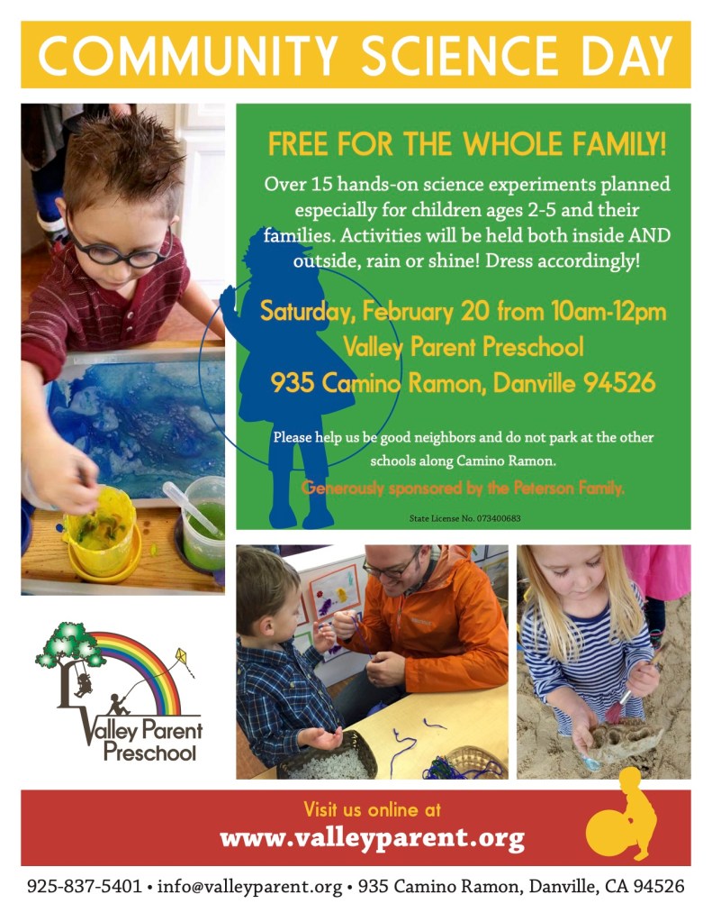
Flyer for Valley Parent Preschool community science day
I was asked to update the look of the handouts for the Valley Parent Preschool to give them a more up-to-date look, but to keep the old logo. Some photos where taken by me during class or provided by my client.
I was responsible for this logo from beginning to end. My client was unhappy with a logo they had an online company create and wanted to see what an actual designer could do. We started with a questionnaire and then I provided a few rough ideas, from there I refined and adjusted designs based on the client feedback. Once we reached this great design, I then created business cards, stationery, PowerPoint templates and digital files for my client to use along with colors and fonts in a brand guideline document.
the Tribeca Film Festival
On this project I was a contract designer and was given film stills and copy to work with and made several concept posters based on suggestions from the client, which were presented by the company that hired me. I then made changes to the design per their instructions and this is the final poster design used at the Tribeca Film Festival.

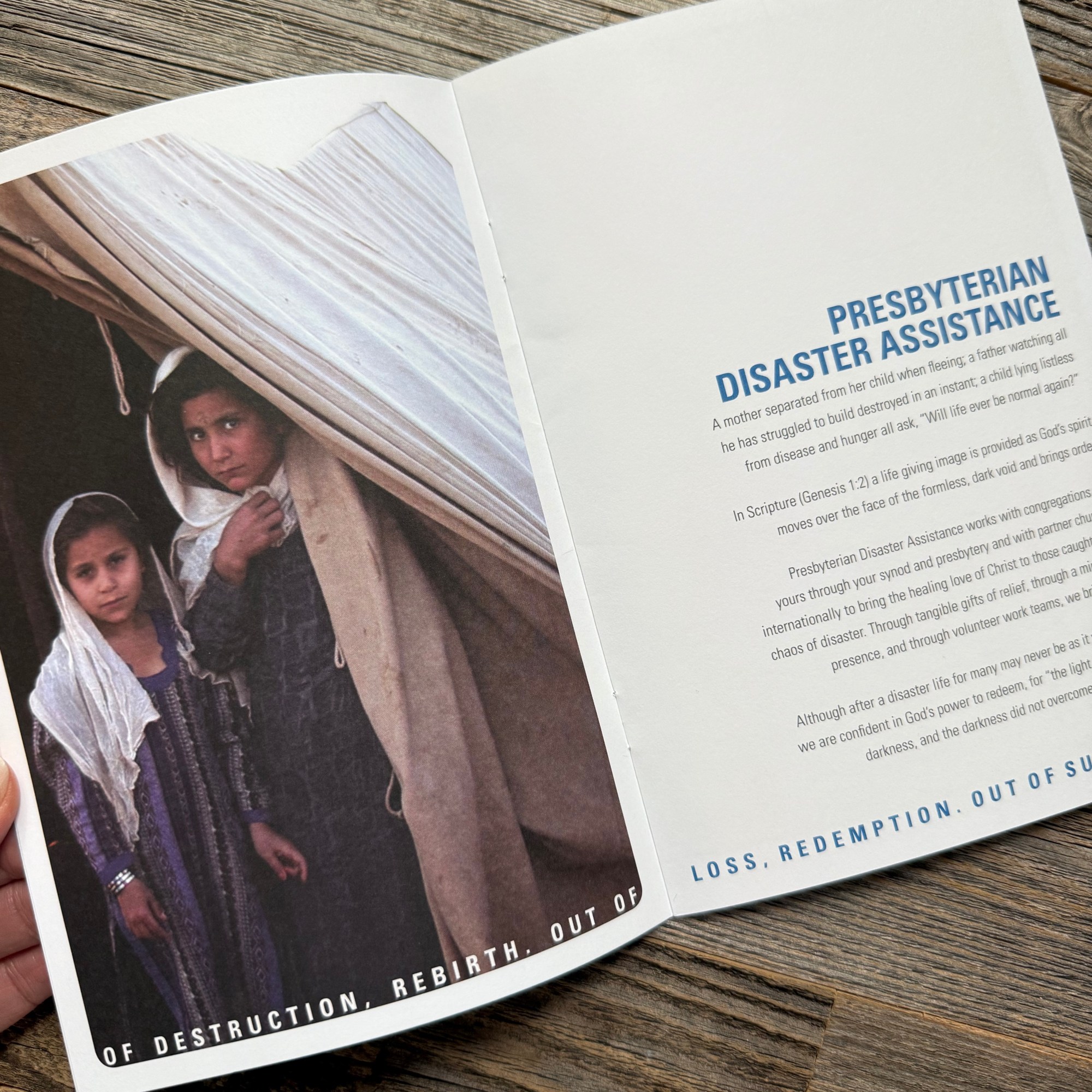

Brochure highlighting the work of Presbyterian Disaster Assistance as part of PC(USA)
When working in the Marketing Department of the PC(USA) I did work for all the agencies within, including Presbyterian Disaster Assistance. In this case I was given photos, copy and a size from the client and I met with them to get a general idea of what they were looking for. I then came up with a design, which I presented to them and from there we refined until the client was satisfied, it was then looked over by a copyeditor and marked up, I did revisions an it was then sent to the printer with the specifications for paper I had made and binding. I was sent printer proofs to approve before the final run to ensure accuracy, then after final approval they went to press.

This was a freelance flyer project where I was given little direction, basically just the logo graphic and the text and was allowed to do something that caught people’s attention.

This client had a strong idea of what she wanted and I was just there to help facilitate her vision. I met with her and sketched out a few ideas and went straight into designs on the computer and refining them. Once we reached the desired logo, I created versions of it for stickers, business cards, web, instagram, stationery and Facebook.

My client gave me the copy and logos that needed to be included and asked me to come up with something involving a hive. I presented several ideas and after a few revisions of the one she preferred this was the final agreed upon design which was featured in the Georgia Tech Magazine.
Based on an already established logo, this brand needed sub-branding done to go along with it and look like a cohesive team of brands. I was the designer in charge of creating each of the logo graphics based on the ideas given to me by the Art Director in charge of the project.

Logo design for Kentucky Select Properties real estate agency.
I was part of a team of people working on this project, which began with meeting with the client and brainstorming ideas and sketching roughs. Once a few ideas had been agreed upon I was tasked with creating them in Illustrator to then present to the client. After that revisions were made and the logo was refined. Once the final logo was selected, I was assigned to creating business cards, letterhead, yard signage, building signage, web graphics and website layouts.

Invitation Design
Quad fold invitation design for Planned Parenthood fundraising event at the Louisville Slugger Museum, playing off the fact that when you tour the museum each guest gets a miniature “baby” bat at the end. Original idea was by a colleague, I was responsible for taking photos of the bats, finding the image of the stroller and using Photoshop to combine the images. After that I designed the layout of the invitation and added the copy and logo provided by the client.
While working at the PC(USA) I was chosen to be the designer for this project and was involved in all the meetings and creative development of the logo. The name was already in place but the hand concept was my idea and I presented several iterations of it before we came to this final design. Besides the logo I also ended up designed several brochures, flyers, PowerPoint templates, business cards and bookmarks to match the same look and feel of the logo and was responsible for coordinating the printing and specifying paper choices and approving final printer proofs before final production.

This was an old publication that needed a design updated to be more modern and to adhere to the new brand standards set for the PC(USA). I was assigned the task to re-vamp the entire layout. After an initial meeting with the client to determine exactly what they were looking for they provided images and copy to me. Once I had a rough layout I sent the client printed proofs to look over and approve or make changes to the design, once the layout was decided, I put in the final copy which was reviewed again for any corrections or changes. Once approved by the client, it went to the print and the client and myself signed off on the printers proof before final production.

The Presbyterian Church puts on a large gathering every year and each entity within the church has a booth with brochures describing their work, this was the one for Presbyterian Disaster Assistance. Working with the client we decided upon a size and I was allowed to create a brochure that was in keeping with the their organizations look and feel to create a cohesive brand. As part of my job I collaborated with the printer and specified paper quality, thickness and finish. Final approval was done by myself, the client and the Marketing Director.

I was given free reign to completely redesign the Mission Crossroads magazine from cover to cover. Working with the client we discussed the look and feel of the update, with that in mind and newly developed brand standards I went about creating new table layouts that would be easy to follow along with type and paragraph styles to make future editions easy to create. On this first edition of the new design I edited all the photos and did color correction as well as placed all text and did copyedits as marked by hand by internal copyeditors. Final printer approval was done by myself, the client and the marketing director.
